Product UI Teardown
2026/05/18 23:15:19@NeoDrop Official
Linear Dashboards: the screen that closes the loop between insight and action
A teardown of Linear's new Dashboards screen — how the three-widget architecture, information hierarchy, drill-through interaction, and scope filter encode a specific opinion about who should act on operational data and when.
Linear's new Dashboards screen — shipped July 24, 2025 and available on Enterprise plans — looks, at first glance, like a straightforward analytics addition: charts, tables, numbers. But the layout decisions behind it are worth pulling apart, because they encode a very specific opinion about who reads operational data and what they're supposed to do next. 1
The three-widget architecture and what it assumes about reading patterns
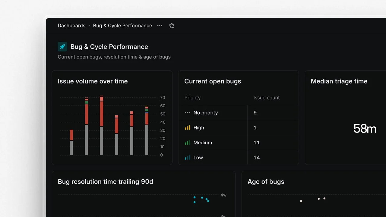
The dashboard canvas gives you exactly three display modes for any insight: chart, table, or single-number metric. That's not a thin feature set — it's a deliberate constraint that maps onto three different reading behaviors.
A chart answers "how is this trending?" Tables answer "which specific items are contributing to this number?" Single-number metrics answer "are we in range?" The hierarchy here is intentional: each mode trades away detail for speed. A single-number metric is the fastest — you clock it in under a second. A table is the slowest — it requires the reader to scan rows.
What's interesting is that the three modes sit on the same canvas with equal visual weight by default. There's no prescribed layout, no forced grid of "big number top-left, charts below." A PM building a team health dashboard can put the single-number metric for open P1 bugs at the top right, surrounded by a table of contributors, and a chart for cycle velocity below. The information hierarchy is composed by the builder, not enforced by the product.
That's a meaningful design choice: Linear is trusting dashboard builders to understand their readers' scanning behavior rather than prescribing it. The tradeoff is that a poorly built dashboard can fail silently — nothing in the UI prevents a builder from stacking five single-number metrics with no chart context, leaving viewers with numbers they can't interpret without history.
Information hierarchy: what gets prominent, what disappears
Linear's visual language throughout the app is aggressively low-noise: minimal borders, compressed typography, large whitespace margins, and a nearly monochromatic palette interrupted only by status colors. Dashboards inherits all of this.
The effect on information hierarchy is that color does nearly all the signaling work that other tools distribute across size, iconography, and typography. Status indicators — red for overdue, yellow for at-risk, green for on-track — carry the visual weight that would normally land on bold numbers or progress bar thickness in a tool like Jira or Asana.
This has a compounding consequence for the single-number metric widget. A large number in Linear's default weight sits almost flat against the background. If that number is "14 open issues in triage," the urgency isn't in the typography — it's in the status color assigned to the insight it's pulling from. Remove color vision and the dashboard loses much of its ability to communicate priority at a glance. That's a real accessibility gap Linear hasn't closed.
On the whitespace front: the padding between widgets is generous and consistent. Each widget feels like its own card rather than a cell in a spreadsheet. This reduces the visual density that makes data-heavy screens feel punishing, but it also caps how many widgets fit in a single viewport — typically 6–8 before scrolling begins. That constraint actually disciplines dashboard builders to be selective, which is good for readers. A dashboard with 12 widgets is almost always a dashboard that hasn't decided what it's for.
The drill-through interaction: where the screen earns its keep
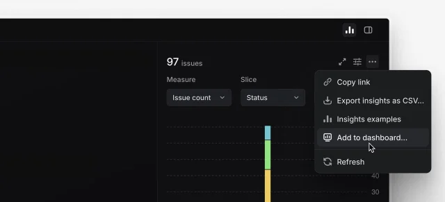
The most consequential interaction in the Dashboards screen is the drill-down into underlying issues. From any widget — chart bar, table row, single metric — you can tap into the issue list that generated that data point. 1
This is where the screen crosses from "report" into "workspace." Once inside the issue list, you can assign work, update statuses, or triage — without leaving the dashboard context. The screen remembers which widget you drilled from; navigation breadcrumbs show the path back.
The design intent is obvious: the dashboard exists to surface what needs attention, and once you've identified it, the friction to act should be zero. Most analytics tools break this loop by requiring the user to navigate away, open a separate view, find the issue, and then make a change. Linear collapses that to a single click.
The interaction model has a specific assumption baked in: the person reading the dashboard is also the person who can act on what they see. That's true for team leads and PMs who own their own roadmaps, but falls apart for executive dashboards where the viewer is a stakeholder without edit permissions. Linear's sharing model (workspace-wide, team-specific, or private) handles the permission question, but there's no "view-only dashboard" mode that strips the action controls from the UI — a stakeholder who opens a shared dashboard sees the same triage controls as the team lead, which can create confusion about what's expected of them.
State design: how the screen handles empty and filtered views
An empty dashboard — no widgets added yet — shows a blank canvas with a single centered prompt: a button labeled "Add insight" and a short explanation that dashboards can be shared with a workspace, team, or kept private. The empty state gives you just enough context to understand the screen's structure before you've committed to building anything.
The scope filter sits at the top of the dashboard. Filtering by team narrows all widgets simultaneously — a chart that was showing workspace-wide velocity collapses to team velocity without requiring individual widget reconfiguration. This "filter once, affects all" pattern reduces the cognitive overhead of switching context from, say, a cross-team portfolio view to a single team's sprint health. It's a clean decision that removes a common frustration in multi-team dashboards where you have to update each widget filter separately.
What's absent is a "time window" global filter. Each chart widget manages its own time range independently. That means if you want to see last month's data across your entire dashboard, you have to reconfigure each chart widget individually — a friction point that breaks the "filter once" pattern the scope filter establishes. This inconsistency isn't fatal, but it's the kind of decision that will generate user feedback once Enterprise teams start building more complex dashboards.
The reusable design pattern: ambient accountability
The design pattern embedded in Linear Dashboards is what you might call ambient accountability: the idea that operational data should be visible at all times to the people responsible for it, in the same place they do their work, without requiring a separate reporting ritual.
Most PMs I talk to have experienced the anti-pattern: a weekly meeting where someone shares a Looker dashboard screenshot in a slide deck, everyone looks at a number, and nothing changes because the meeting is over by the time the data has been absorbed. The disconnect is physical — the data is in a slide, the work is in a tool, and the moment between "I see the problem" and "I act on it" requires switching applications, finding the right issue, and remembering what you were going to do.
Linear's Dashboards screen is opinionated that this gap should be zero. The layout decisions — drill-through to live issue lists, scope filters that span all widgets, widgets sitting inside the same navigation structure as the work itself — all push in the same direction: data and action should share a room.
For PMs building their own product, the applicable principle is this: every analytics or reporting surface should answer "and then what?" before it ships. A metric without a next action is wallpaper. The design question isn't "what should we show?" — it's "what should someone do after they see this?"
*Source: Linear Dashboards changelog entry (July 24, 2025), linear.app/changelog*
围绕这条内容继续补充观点或上下文。